Website strategy, demonstrated

A good website makes the next step obvious.

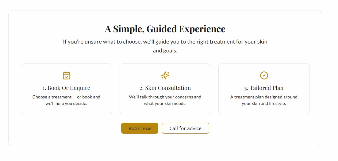
Clear information, real proof and mobile-friendly journeys help customers trust you and act.

01 · Hierarchy

Make the important thing look important.

Visitors should know what matters first, what supports it and what to do next without having to decode the page.

Everything the same size
HeadlineSupport textButton
Clear hierarchy
One clear message

Supporting information sits underneath it.
02 · Sectioning

Long pages only feel long when nothing has a job.

Good sectioning turns a pile of information into a sequence. Try the demo.

Problem
Proof
Offer
Next step
03 · Movement

Movement is useful when it keeps content discoverable.

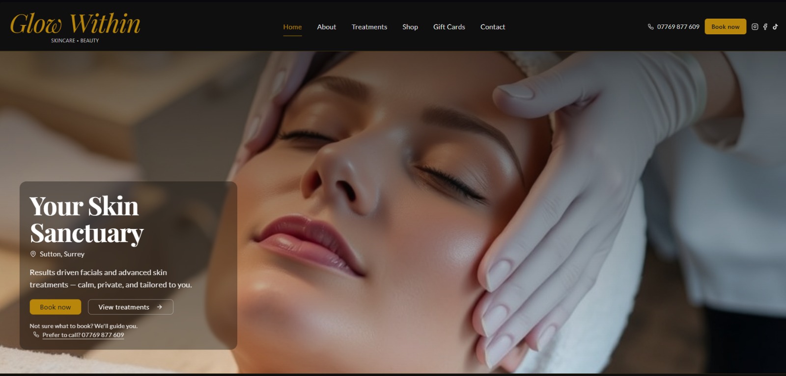
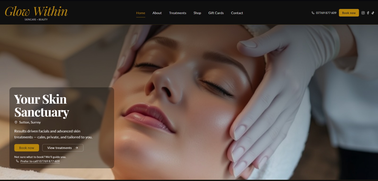
This is based on the treatment carousel I built for Glow Within. It moves automatically on desktop, pauses when someone hovers over it and becomes swipeable on touch devices.

Live interaction demo

Featured treatments, always moving.

This recreates the behaviour built for Glow Within: automatic movement on desktop, hover to pause and swipe on touch devices.

Featured
Skin treatment

Million Dollar

Designed to keep useful choices visible without turning the page into a wall of links.

Explore treatment →
Featured
Skin treatment

Decaar

Designed to keep useful choices visible without turning the page into a wall of links.

Explore treatment →
Featured
Wellbeing

Massage

Designed to keep useful choices visible without turning the page into a wall of links.

Explore treatment →
Featured
Beauty

Lashes & Brows

Designed to keep useful choices visible without turning the page into a wall of links.

Explore treatment →
Featured
Skin treatment

Clinic Care

Designed to keep useful choices visible without turning the page into a wall of links.

Explore treatment →
Featured
Gifting

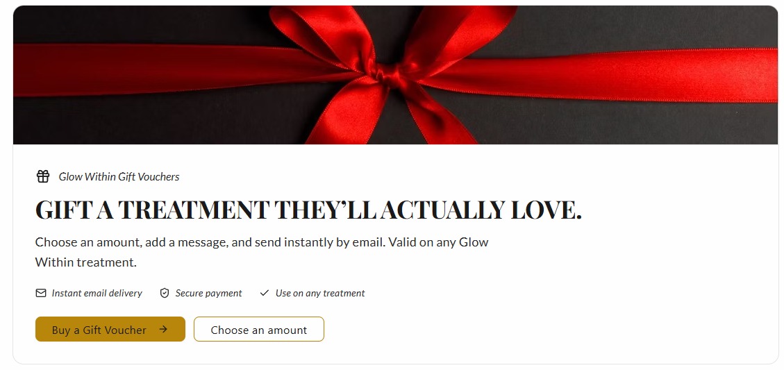
Gift Vouchers

Designed to keep useful choices visible without turning the page into a wall of links.

Explore treatment →
Featured
Skin treatment

Million Dollar

Designed to keep useful choices visible without turning the page into a wall of links.

Explore treatment →
Featured
Skin treatment

Decaar

Designed to keep useful choices visible without turning the page into a wall of links.

Explore treatment →
Featured
Wellbeing

Massage

Designed to keep useful choices visible without turning the page into a wall of links.

Explore treatment →
Featured
Beauty

Lashes & Brows

Designed to keep useful choices visible without turning the page into a wall of links.

Explore treatment →
Featured
Skin treatment

Clinic Care

Designed to keep useful choices visible without turning the page into a wall of links.

Explore treatment →
Featured
Gifting

Gift Vouchers

Designed to keep useful choices visible without turning the page into a wall of links.

Explore treatment →
04 · Calls to action

Do not make people hunt for the next step.

A strong CTA is not about shouting louder. It is about being obvious at the moment someone is ready.

05 · Social proof

Let somebody else say you are good.

Real work and named feedback remove more hesitation than another paragraph of self-promotion.

“
Working with Joe was really easy. He took the time to understand my business and delivered exactly what I needed.
Hannah · Glow Within
06 · Mobile behaviour

The same feature should respect the device it is on.

The Glow carousel moves itself on desktop. On touch devices it stops fighting the user and becomes horizontally swipeable. Responsive design is behaviour, not just shrinking boxes.

Desktop
Swipe →